FYJ is covering some of the basic principles in these weeks ahead, but approaching them in a different way than the traditional theoretical - and I find the approach much more useful, more practical in applying them. I'm doing those exercises, but also starting to explore things that I'd like to incorporate into my own emerging style.
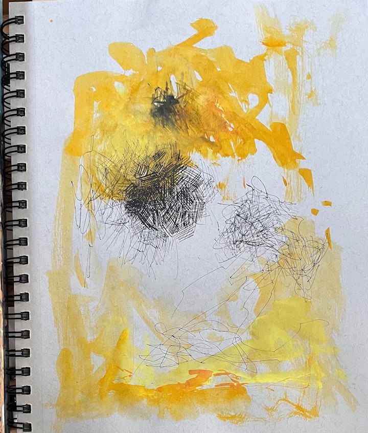
I did a couple studies like this on the Strathmore grey 9x12 pad. I used 2 colors of acrylic ink with a brush or dropper/nib and india ink with a crow quill pen. So I'm experimenting with looser abstract brushstrokes contrasted by tighter pen/ink cross-hatch marks. I'm fascinated with depicting energy in space... I don't know that this is quite 'it', but I keep doing this same thing. And I just thought of something... this style could become figurative quite easily, defining realistic parts in pen, extending looser lines outward that merge with loose abstract brush strokes. I also see the possibility of letting some very vague form emerge with the crosshatch marks... almost like Cezanne did in some of his watercolors.
LAST NEXT